MA Inclusive Art Exhibition
Paintings
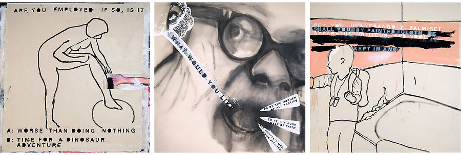
Left: Prometheus_AlignmentCheck (pencil, handmade paint, collage on paper. 120cm x 185cm).
Right: HUNT_SEARCH_ibid (pencil, recycled printer ink, collage on dust sheet).

Prometheus_AlignmentCheck
If you would like to find out more about this painting you can download an extended text PDF.


HUNT_SEARCH_ibid
If you would like to find out more about this painting you can download an extended text PDF.


Books
These 3 books I see as stand alone objects. 'ibid' perhaps belongs with my painting HUNT_SEARCH_ibid, 'Prometheus_research' perhaps expands upon the painting Prometheus_AlignmentCheck, while 'SelfReflection_notes' is to be read more as an extended text about my post graduate studies & research. (Actually it's more about exploring the print processes behind the production of a book. These books were, pre-lockdown, going to be screen printed...)


Click on a cover image to open the book. To download a PDF of the book select ibid or Prometheus or Self Reflection_Notes.
If you download a PDF please consider donating to JustLife (my art-research partner, a brilliant charity that helps the homeless and vulnerably housed to improve their life chances).
ibid Book
A deconstructed book: cover; intro; main text; index. I wanted to see how redrawing text would affect its meaning, so this book looks at the grammar of books & poetry & the print process, how meaning is gained through new ways of looking.


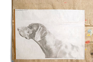
Prometheus_research Book
Here I am continuing to reference the knowledge usually kept hidden from general view. The use of printer's marks links to the liminal, hidden spaces usually unseen in the creative process. The large cliff face image is broken into page sized sections, perhaps alluding to the repetitive nature of the this drawing process, as well as to the fate that befell Prometheus.


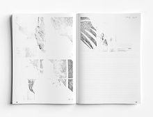
Self Reflection_notes Book
This book is available to download in 4 editions (81pages each. Click on the book colour/name to download a PDF: 1. Cyan, 2. Magenta, 3. Yellow, 4. Black.
Why have I divided the book into 4 versions? I am a print designer as well as an artist, and I wanted to play with the process of 4-colour offset printing, where the image is split into separate colour files. Interesting image variations are thrown up by this process, information is lost, what was clear becomes opaque, meaning is shifted away from object to material...
If you download a PDF please consider donating to JustLife (my art-research partner, a brilliant charity that helps the homeless and vulnerably housed to improve their life chances).


Other work...
Proletkult (Bogdanov) (1000mm x 1000mm each. Mixed media/collage on canvas) 2018
Related to research into participatory/inclusive art
_diptych_sm.jpg)
PDP/Search/Hunt (1000mm x 1000mm. Mixed media/collage on canvas) 2018
Related to research into participatory/inclusive art

Children In Peril, series (1000mm x 1000mm each, oil/mixed media on canvas)
These paintings take the structure of a children's illustrated book, using an archetypal story (a child loses/annoys her parents, overcomes obstacles, finds/returns to her parents… "and it was still hot!" etc). In using this structure I wanted to force myself away from the personal, into a narrative which I can disrupt and touch upon, not just social issues, but also notions of art practice, & how text can lead the viewer away from obvious interpretations.


Work pre-2015
Pit-Pond, series (No more than 1300mm wide, oil/mixed media on canvas)
These paintings aim to show the entropy that builds within a society, a society that scars and empties the landscape. The simple ‘open’ metaphor used (a flooded pithead) serves as a fixed, coherent form within the paintings. A form through which I can explore the pure language of painting – form, colour, composition – through imagery without figures yet implying a profound human activity, stripped of any artistic conceit, complications, or games…
… oh, hang on, that’s not right, they are called Pit-Pond paintings because my name is Pitt and my wife’s is de la Mare (of the pond), and I thought it funny. In fact I wanted to give these paintings very personal and specific titles, titles that really jarred with the simple, open design of the paintings. But Richard thought this was a shit idea. I have, however, called the 3rd painting 'PIT POND 3 Richard Ducker'.